

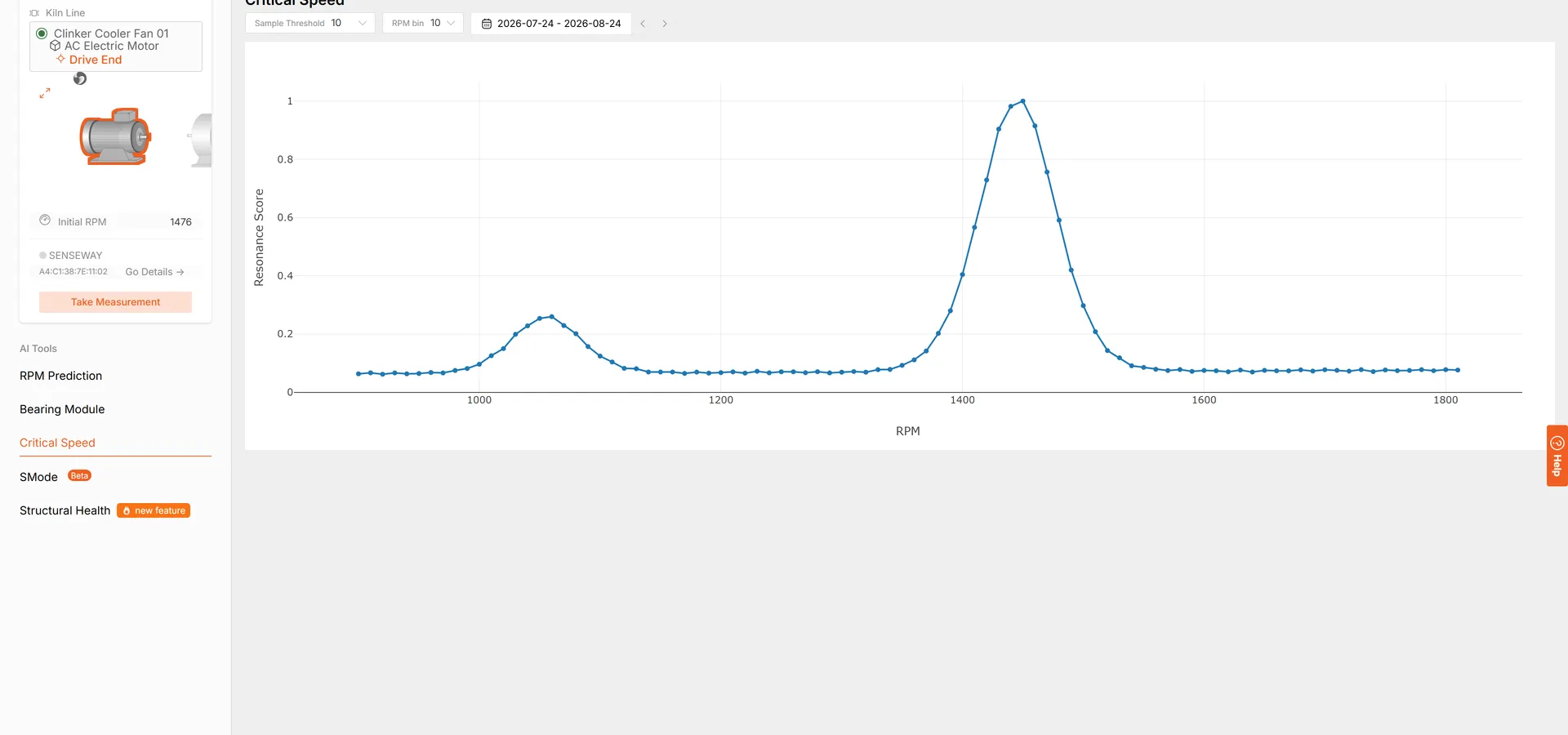
Critical Speed answers a question that is usually settled by argument: which speeds should this machine not sit at? The tool plots resonance across the speed range for a sensor point, so the speeds where the machine’s own structure amplifies vibration are visible instead of inferred.
Why a Machine Can Be Fine at One Speed and Not Another
Every structure responds strongly at certain speeds. Near one of them, an unbalance small enough to ignore anywhere else produces vibration large enough to shorten bearing life. This is why the same machine can read healthy at one production setting and alarming at another with nothing inside it having changed, and why a vibration reading without the speed it was taken at is worth less than it looks.
A Map Rather Than a Number
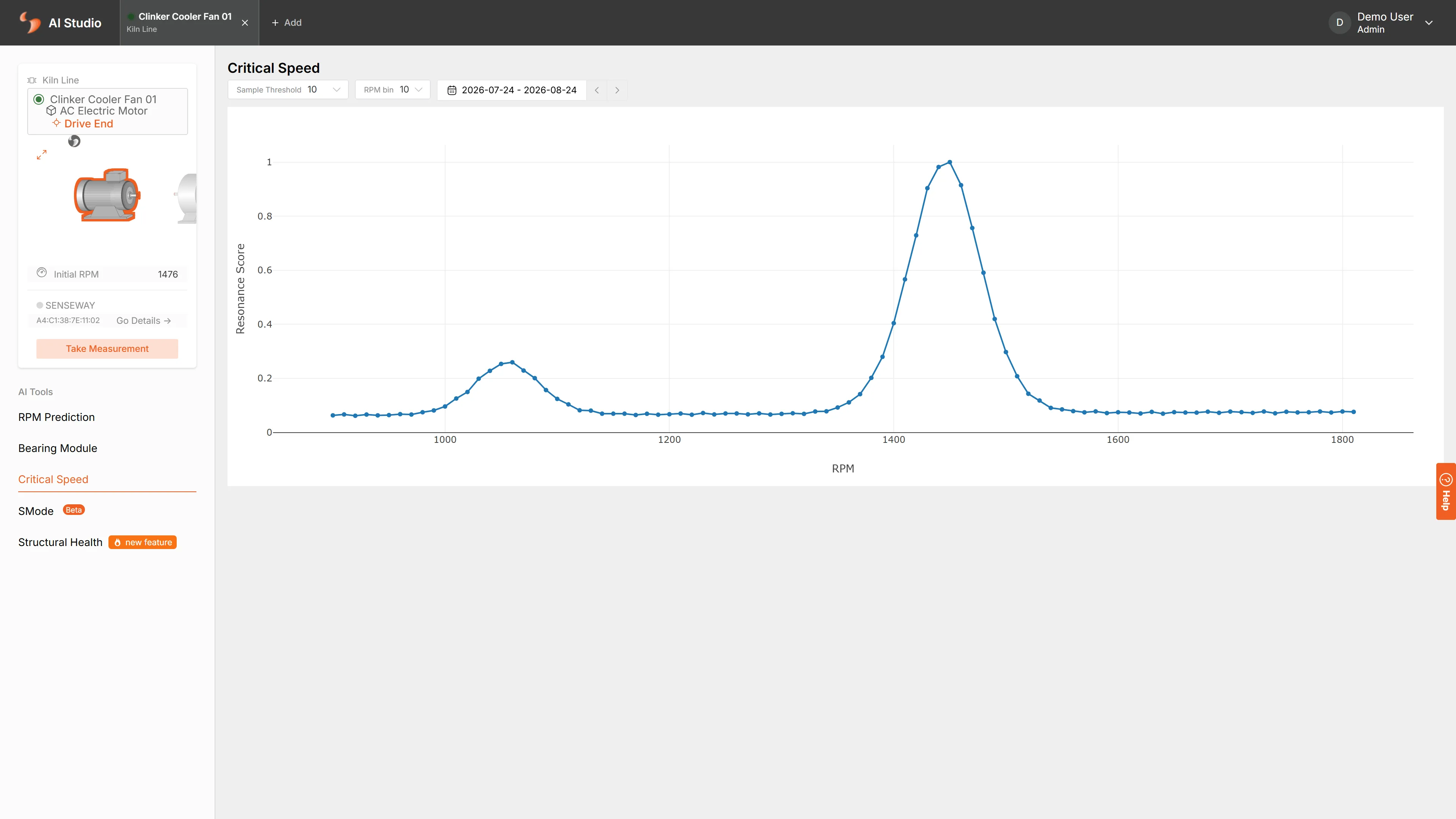
Instead of a single figure, the tool gives a curve across the speed range, taken from the measurements already collected over the date range you pick. Reading it is straightforward: the peaks are the speeds to move through rather than settle on. You choose how wide each speed band is and how many measurements a band needs before it is plotted, so a band with too little behind it is left out rather than drawn on thin evidence.
Where It Changes a Decision
Three situations turn this chart into an action. A new line speed is being considered, and the question is whether it lands on a peak. A variable-speed drive is being commissioned, and a band needs to be locked out. Or a machine is vibrating only at certain outputs, and the argument about whether that is a bearing or the structure needs settling before anyone opens it up.
Where to Find It
Critical Speed is in AI Studio, alongside RPM Prediction, the Bearing Module, Structural Health and S-Mode. Choose the sensor point and the date range, and the chart is built from measurements that are already there.
Frequently asked questions
What does the Critical Speed tool show?
Resonance plotted against running speed for a chosen sensor point over a date range. Where the curve rises, the machine is close to a speed at which its own structure amplifies vibration, so the chart reads as a map of the speeds to pass through quickly rather than sit at. Two controls shape it: the width of each speed band, and how many measurements a band needs before it is drawn at all.
Why does the same machine vibrate at one speed and not another?
Every structure has speeds at which it responds strongly to the forces already acting on it, and near those speeds a small unbalance or misalignment produces far more vibration than it would elsewhere. That is why a machine can look healthy at one production setting and alarming at another without anything inside it having changed.
Is this useful for a fixed-speed machine?
Yes, in two ways. A fixed-speed machine still passes through the whole range every time it starts and stops, and the map shows what it passes through. And when a plant changes a line speed or fits a variable-speed drive, knowing where the resonances sit is what stops a new set point from becoming a new vibration problem.
Do I need a special test to produce it?
No. The tool works over the measurements already collected on the sensor point across the date range you choose. There is no run-up test to schedule, no shutdown and no extra instrumentation to fit for it.